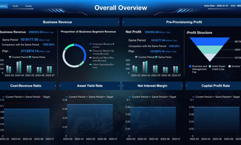
Why Data Insights Get Lost in Dashboards

Dashboards are designed to make data accessible and actionable, yet critical insights often get lost in the noise. Teams frequently encounter complex metrics, overlapping KPIs, inconsistent reporting structures, and multi-source data that obscure trends and anomalies. Without careful interpretation, dashboards may fail to guide strategic decisions, and analysts can spend hours reconciling data instead of delivering insights.
To address this, many organizations turn to GPT analysis tools that automatically summarize patterns, highlight anomalies, and flag actionable metrics. These tools help teams focus on insights that matter most, while ensuring transparency and consistency across reports.
Why Insights Disappear
Even well-designed dashboards can fail to surface key insights. The main causes include:
Overcrowded Visuals
Too many charts, graphs, or KPIs in a single dashboard can overwhelm users. When important trends are surrounded by less relevant data, they can be easily overlooked.
Ways to improve clarity:
- Limit the number of metrics per dashboard
- Highlight priority KPIs with color or size
- Group related metrics logically to create context
Inconsistent Data Sources
Data from multiple platforms often vary in format, timing, and calculation logic. This can create inconsistencies that make dashboards unreliable.
Best practices:
- Standardize metrics across all sources
- Reconcile timing differences to align data
- Document definitions and calculation methods
Lack of Context
Numbers without context are often meaningless. Users may see a drop in revenue or clicks but not understand why it happened or what action to take.
Ways to add context:
- Include historical benchmarks or targets
- Use trend lines and comparisons
- Annotate anomalies to explain the causes
Delayed Updates
Dashboards that are not refreshed frequently may present outdated data. Teams relying on stale information risk making decisions based on incorrect trends.
Solutions include:
- Schedule automated updates
- Track refresh schedules for each data source
- Notify stakeholders when data is delayed
Techniques to Preserve Insights
Segmentation and Filtering
Segmenting data by customer type, geography, campaign, or time period can reveal trends hidden in aggregate metrics. Filters allow users to focus on the most relevant slices of data, making patterns easier to interpret.
Visual Hierarchy
Applying visual hierarchy ensures that critical metrics are prominent. Designers can use size, color, and placement to direct attention to the most important insights.
Automated Summaries
AI-driven dashboards can generate natural language explanations of trends and anomalies. This reduces misinterpretation and provides context for stakeholders with varying expertise.
Collaboration Across Teams
Insights are more actionable when cross-functional teams are involved. Marketing, finance, and operations teams can validate metrics and interpret patterns from different perspectives.
Best practices:
- Conduct regular review meetings
- Align dashboards with business objectives
- Incorporate qualitative feedback from users
Common Pitfalls in Dashboard Design
Even with advanced tools, dashboards fail if maintenance and user needs are neglected. Common pitfalls:
- Overly complex or cluttered visualizations
- Outdated or incomplete data
- Misalignment between KPIs and decision-making needs
- Ignoring user accessibility or readability
Preventing these issues requires a combination of good design, training, and ongoing monitoring.
Leveraging GPT for Clarity
Integrating GPT into dashboards allows teams to quickly identify patterns and actionable trends. AI-generated summaries explain complex metrics, detect anomalies, and consolidate multi-source data automatically.
Benefits include:
- Concise and understandable trend summaries
- Faster anomaly detection
- Consistent interpretations across reports
- Reduced manual effort for analysts
Scaling Insights Across Teams
Many organizations adopt the Dataslayer analytics platform to unify data from multiple sources, automate reporting, and maintain clarity across teams. This ensures that key metrics are visible, actionable, and consistently interpreted at every level of the organization.
Additional advantages:
- Centralized access to all dashboards
- Scalable reporting for growing datasets
- Easy sharing and collaboration between teams
- Preservation of insight accuracy and integrity
Final Thoughts
Data insights can easily get lost in dashboards due to complexity, poor design, inconsistent sources, or a lack of context. Combining thoughtful dashboard design with GPT analysis tools enables teams to surface actionable insights efficiently. Platforms like Dataslayer analytics platform further ensure that reporting is scalable, consistent, and aligned with business goals, turning complex datasets into decision-ready intelligence.


